We are a freelance graphic design company established in 1982 producing design, artwork and print. Working for a range of clients from individuals and cottage industries requiring a logo and promotional material to large international companies requiring brochures, annual reports and product developments. Each is given the same personal service and we are praised for our work, prices and reliability.
Monday, June 28, 2010
Writing articles and photography for fishing / angling magazines
Those of you who know us will know that Gary is just 'slightly' interested in fishing(!) Though I think that is the understatement of the year!
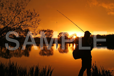
Gary and Sam, our 15 year old son, go fishing at any available opportunity and because they are interested in photography too they've put the two together and have started writing articles and supplying photographs to fishing magazines.
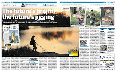
The above double page article was published in The Angling Times a few months ago and over this past year they have been writing quite a few articles and have a vast photographic library now of fishing, landscapes, different locations we've been to here in the UK and abroad and associated nature subjects.
So any journalists out there looking for material for your magazine on any of these subjects please get in touch.
Wednesday, June 23, 2010
A few tips on good advertising
We have listed a few solid qualities and sound principles characteristic of good advertising. Not all will apply to every medium, but the impact is the same.
WHAT YOU SHOULD KNOW BEFORE WRITING AN AD
• What are you trying to say?
• What is it you are trying to sell?
• What is your proposition?
• What will you put in the ad?
• Where will you put the ad?
• How do you extend the ads results to the point of sale?
PRINCIPLES OF GOOD ADVERTISING
• Command attention, but never offensively.
• Be imaginative, but never misleading.
• Tell the truth.
• Be altruistic by selling service.
• Keep it simple.
• Offer the privilege of buying.
• Never seek favour or profit for yourself.
• Never advertise negatively or put a competitor down.
QUALITIES OF GOOD ADVERTISING
• Instead of telling a customer how good your product or service is, tell them how good your product or service will make them.
• Graphics must support the main idea without cluttering.
• Be sure headlines and subheads are brief and to the point.
• You can overestimate the public's knowledge, but never their intelligence.
• If an ad is profitable, don't change it by trying to make it better.
• Sell the results of a product, rather than the product itself.
Source: SolveYourProblem.com
Monday, June 21, 2010
A bit about us
OK, so where do I start? Our graphic design business goes back 30 years and I don't want to bore you with too much detail so I will make it as brief as possible and maybe add more as I go.
Basically, I met my husband, Gary, at Stevenage College in 1979 on a 3yr East Anglian Diploma in Graphic Design course. We left in 1982. Gary with a Distinction and me with an Upper Pass. During that year we decided to go straight into 'going it alone' and set up Edmonds and Hunt Advertising.
In 1985, 3 years later we got married. (We didn't change the name of the company as everybody knew us as Edmonds and Hunt Advertising). We bought a house in Port Vale in Hertford where we ran our studio from two bedrooms that we had knocked into one. Cow gum, spraymount, layered artworks, letraset and PMT's all come to mind from the 4 years we were there.
Gary was an airbush illustrator and the house was forever covered in this green dust - whatever colour he had been using it was always green?!
Anyway, the business took off and we were illustrating and doing artworks for companies like Walkers Crisps and all the on pack promotions for Shreddies and other cereal packs. Back then there were no computers so all the typography and illustrations were produced by airbrush.
After 4 years we moved to Chapmore End, where we are now. Computers came in and we had a studio built on the back of the garage. 20 years on and the company is still producing design, artwork and print and we even have some clients that have remained with us for the last 30 years.
That's it in a nutshell without any detail - hope I haven't bored you and hope you'll follow my blogs.
Subscribe to:
Posts (Atom)