See a small selection of our work on our website and more albums on our Facebook page
click on the images above to be redirected to our website
Tuesday, November 09, 2010
Quick tip: InDesign nice little shortcut
Simply press the 'W' key when working in InDesign. This will allow you to just see the page you are working on, by framing it, rather than viewing the pasteboard and bleed aswell. Press it again to see your bleed and pasteboard.
Thursday, October 28, 2010
Quick tip: The headline to your ad must sell your product or you have wasted 90% of your money
"In a print ad, 75% of the buying decisions are made at the headline alone."
- John Caples, the advertising industry's acknowledged forerunner of rigorously tested, measured, and verified advertising effectiveness
"On average, 5 times as many people read the headlines as read the body copy. It follows that, unless your headline sells your product, you have wasted 90% of your money."
- David Ogilvy, founder of the renowned Ogilvy & Mather advertising agency
Wednesday, October 27, 2010
Advertising soars
Headline in The Times today:
Reasons to be hopeful
Growth surprises City. Advertising soars. Strongest rebound since the War. WPP, the world's biggest Advertising Agency, said yesterday that it expected its strongest sales growth for nearly a decade.
Reasons to be hopeful
Growth surprises City. Advertising soars. Strongest rebound since the War. WPP, the world's biggest Advertising Agency, said yesterday that it expected its strongest sales growth for nearly a decade.
Monday, October 11, 2010
Quick tip: to blur background to make an object sharp on a photograph
 If you want the eye to 'home in' on an object on an image by blurring the background, try this tip in Photoshop. There are other ways too, (ie. pathing etc.) but I find this quick and easy:
1. Open your image in Photoshop
2. In the layers palette click the arrow in the circle top right of the layers box and from the drop down menu select 'duplicate image'. Click 'OK' for background copy on the window that comes up.
3. In the 'Filter' drop down menu along the top of your screen drag down to 'Blur' then from that drop down menu choose 'Gaussian blur'.
4. Set the radius pixels by sliding the scaler to the 'blurriness' that you want the background. You can zoom in or out of the picture by clicking on the + or - buttons to see more of your image. Then click OK.
5. Back in the layers palette click on the 'opacity' arrow and drag the slider down a bit so you can see the sharper image through the blurred image.
6. Now, in the tools palette, click the 'eraser' button. Make sure the 'mode' along the top is 'brush' then click on the 'Brush preset picker' icon with a number under it.
7. Set the diameter of the brush to one that you can use for the detail that you need on the image. Whether it's smaller for detailed images that you want picked out, or a larger brush for blending out slowly. Also, set the hardness of the brush to what you need - 100% hard for detailed images picked out, 0% for blurring out gradually.
8. Back on your image, gently rub out the part of the image that you want sharp - you can set the opacity of the brush lower and gradually build it up by going over it a few times if you want to be more accurate.
9. Finally, when you're happy with your rubbing out, reset the opacity of the layer back to 100%. Back in the circle top right of the layers box, from the drop down menu select 'flatten image' and resave. Viola!!!
Tuesday, September 21, 2010
Quick tip: Easily finding the cursor in Photoshop if it's the same colour as your background
Sometimes you can't see the cursor when you're in a greyish area of your document.
Quick tip: press the spacebar and the hand icon will be displayed where the cursor is 'hiding'.
Friday, August 20, 2010
Quick tip: Advertising rates are not set in stone. Always negotiate.
This applies to all advertising whether it be magazines, newspapers, radio or TV etc. Let the person selling you the ad space know early on that you're not interested in their full rate. A 20 to 30% reduction makes your ad more profitable.
Also, booking your ad closer to the deadline is more open to negotiation as Sales teams become more desperate to sell the ad space to reach their targets and fill the space. You could be surprised at how low they're willing to go rather than let the deadline pass without booking anything!
Also, booking your ad closer to the deadline is more open to negotiation as Sales teams become more desperate to sell the ad space to reach their targets and fill the space. You could be surprised at how low they're willing to go rather than let the deadline pass without booking anything!
Thursday, August 19, 2010
Quick tip: Always advertise on the right hand page of a magazine
Why?
Because when people flick through magazines they normally flick through from the back. Eyes are drawn more to the right hand page that lays flat as you flick. Statistically, more people will see your ad on that page. If you can stipulate outer right hand page to the publication, even better.
You may pay a bit more for your advertising as this has been tested time after time and results show campaigns are more successful if advertised on the right hand page but it would be worth it.
So when booking your ad space ask for a right hand page.
Monday, July 26, 2010
Quick tip: Finding Pantone, LAB, HSB and HEX equivalents from RGB or CMYK files using Photoshop
Often I am asked by a client 'what is the Pantone reference' of a logo or something that I've created in 4 colour. This tip takes you to the computer's 'best guess' Pantone equivalent. It is still advisable to agree on a swatch colour with a client from a Pantone book for absolute 100% accuracy but it is normally pretty near. I am using Photoshop here for my tip but it can also be done in other softwares like Adobe Illustrator.
Also this tip will give you the HSB, RGB, HEX (colour code for web) and CMYK equivalent colours for files.
1. Open the file in Photoshop
2. In the 'tools' window click on the eyedropper tool (pipette icon)
3. Click on the colour you wish to convert on your image
4. Go back to the tool window and click on the square that has changed to the colour (the foreground colour square)
5. A Color Picker window will appear.
6. Click on 'Color Libraries'
7. Scroll down from the 'book;' drop down menu to your required Pantone library. Photoshop will automatically jump to the closest Pantone colour in the list.
To find HSB, RGB, LAB, CMYK and HEX equivalents follow steps 1 to 5 above and in the color picker window it will give you all the values for the above. Note: the box at the bottom with the # sign in front of it is the HEX code - the colour code for web.
Thursday, July 22, 2010
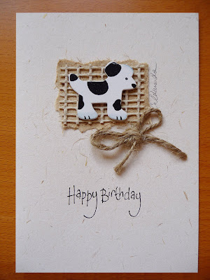
Handcrafted cards
So... whilst the boys are fishing at the weekends - if I'm not doing the girly shopping thing or tagging along with them if the weather is OK, I like to do my hobby which is card making. I started it whilst on chemo last year as it is really therapeutic. Pam (Gary's mum) does it too and we sell at craft fairs and to friends. We've built up a massive stock of different cards and I personalise each one with the same handwriting that you see on the photograph...
 I've just started selling them on ebay too and you can view them if you search for my user name: carolineedmonds you can do this by following these 4 steps:
starfish card
puppy card
I'll gradually put more up on ebay. If you're interested and you're local and can pick them up then I sell them for £1.99 each for A6 size and £2.99 for A5 size - the offer of buy 5 and get 1 free still stands. (The £3.50 charge for the A6 ones on ebay covers my ebay, postage and PayPal fees. If I eventually post A5 ones then they will be £4.50 on ebay).
Just email me or phone with your text details and I will make one for you.
Anyway, I hope you like them - if you do, please save me as a favourite seller on ebay then you can catch up with new ones that I put on there.

 I've just started selling them on ebay too and you can view them if you search for my user name: carolineedmonds you can do this by following these 4 steps:
Click the “Advanced Search” link located at the top of most eBay pages.
On the left side of the page, click the “By seller” link.
Enter carolineedmonds select the “Show close and exact user ID matches” option.
Click the Search button.
starfish card
puppy card
I'll gradually put more up on ebay. If you're interested and you're local and can pick them up then I sell them for £1.99 each for A6 size and £2.99 for A5 size - the offer of buy 5 and get 1 free still stands. (The £3.50 charge for the A6 ones on ebay covers my ebay, postage and PayPal fees. If I eventually post A5 ones then they will be £4.50 on ebay).
Just email me or phone with your text details and I will make one for you.
Anyway, I hope you like them - if you do, please save me as a favourite seller on ebay then you can catch up with new ones that I put on there.


Sunday, July 18, 2010
Lymphoma 2009 and coming through the tunnel

Sorry, it's been a while since our last blog. A lot has been happening which I'll gradually get around to posting - but one thing was that a good friend of mine, Brigitte Houghton, of Houghton Communications: http://www.houghtoncommunications.co.uk who is absolutely red hot in PR (bit of a plug there but she is sooooo recommended - the results she gets you for your business are truly outstanding, and her dynamism, enthusiasm and energy for pushing you and your business along are quite addictive!) said we should post an article about something that happened to me last year. It was the second time somebody had said the same thing - another good friend, Val Reynolds, editor and creator of online health and lifestyle magazine 'In Balance', had suggested the same and had offered to post it on her magazine site: http://www.inbalancemagazine.com.
I was diagnosed with Non Hodgkins Lymphoma, a form of cancer, which I have now been through and come out the other side and all's well, thank goodness, but when it was suggested to me about the article I thought it might be a good idea too to show people that there is light at the end of the tunnel and if anybody out there needs any support then please contact me.
Brigitte wrote the article and Val has posted it on her website under 'Lifestyle'. (see the website above). Houghton Communications also have a blogspot which it is posted on too: http://www.houghtoncommunications.blogspot.com
Thank you to both for your help and special thanks to Brigitte for writing it, I could never have written about myself like that - it's one thing to copywrite for clients but completely different to write about yourself.
And if anybody reading the article would like help through their own personal journey of lymphoma - please don't hesitate to get in touch with me.
Monday, June 28, 2010
Writing articles and photography for fishing / angling magazines


Those of you who know us will know that Gary is just 'slightly' interested in fishing(!) Though I think that is the understatement of the year!
Gary and Sam, our 15 year old son, go fishing at any available opportunity and because they are interested in photography too they've put the two together and have started writing articles and supplying photographs to fishing magazines.
The above double page article was published in The Angling Times a few months ago and over this past year they have been writing quite a few articles and have a vast photographic library now of fishing, landscapes, different locations we've been to here in the UK and abroad and associated nature subjects.
So any journalists out there looking for material for your magazine on any of these subjects please get in touch.
Wednesday, June 23, 2010
A few tips on good advertising
We have listed a few solid qualities and sound principles characteristic of good advertising. Not all will apply to every medium, but the impact is the same.
WHAT YOU SHOULD KNOW BEFORE WRITING AN AD
• What are you trying to say?
• What is it you are trying to sell?
• What is your proposition?
• What will you put in the ad?
• Where will you put the ad?
• How do you extend the ads results to the point of sale?
PRINCIPLES OF GOOD ADVERTISING
• Command attention, but never offensively.
• Be imaginative, but never misleading.
• Tell the truth.
• Be altruistic by selling service.
• Keep it simple.
• Offer the privilege of buying.
• Never seek favour or profit for yourself.
• Never advertise negatively or put a competitor down.
QUALITIES OF GOOD ADVERTISING
• Instead of telling a customer how good your product or service is, tell them how good your product or service will make them.
• Graphics must support the main idea without cluttering.
• Be sure headlines and subheads are brief and to the point.
• You can overestimate the public's knowledge, but never their intelligence.
• If an ad is profitable, don't change it by trying to make it better.
• Sell the results of a product, rather than the product itself.
Source: SolveYourProblem.com
Monday, June 21, 2010
A bit about us
OK, so where do I start? Our graphic design business goes back 30 years and I don't want to bore you with too much detail so I will make it as brief as possible and maybe add more as I go.
Basically, I met my husband, Gary, at Stevenage College in 1979 on a 3yr East Anglian Diploma in Graphic Design course. We left in 1982. Gary with a Distinction and me with an Upper Pass. During that year we decided to go straight into 'going it alone' and set up Edmonds and Hunt Advertising.
In 1985, 3 years later we got married. (We didn't change the name of the company as everybody knew us as Edmonds and Hunt Advertising). We bought a house in Port Vale in Hertford where we ran our studio from two bedrooms that we had knocked into one. Cow gum, spraymount, layered artworks, letraset and PMT's all come to mind from the 4 years we were there.
Gary was an airbush illustrator and the house was forever covered in this green dust - whatever colour he had been using it was always green?!
Anyway, the business took off and we were illustrating and doing artworks for companies like Walkers Crisps and all the on pack promotions for Shreddies and other cereal packs. Back then there were no computers so all the typography and illustrations were produced by airbrush.
After 4 years we moved to Chapmore End, where we are now. Computers came in and we had a studio built on the back of the garage. 20 years on and the company is still producing design, artwork and print and we even have some clients that have remained with us for the last 30 years.
That's it in a nutshell without any detail - hope I haven't bored you and hope you'll follow my blogs.
Subscribe to:
Posts (Atom)